Crossing the line: From designing screens to shipping products
What my first three months at Headout taught me about owning your work
I have been thinking about the handoff.
The model itself. The idea that a designer's job is done when the file is shared, the presentation is finished, and the next person picks up from there.
For a long time that felt like a reasonable division of labour. Designers understand users and intent; engineers understand implementation. Everyone works in their lane and the product gets built somewhere in between. When something gets lost in translation, you raise a comment in Figma, wait for everyone's schedules to realign, and hope the fix makes it through.
I joined Headout in May. Looking back at my first 90 days, I think that model belongs to a different era.
The shift I did not expect
What changed for me is not just which tools I use. It is how far into the product I can now reach.
The old model kept breaking at the seam between design and execution. Stakeholders had competing priorities. Small misalignments in the file became large ones in the product. Getting everyone re-aligned was its own project. Half the time, work just got quietly shelved.
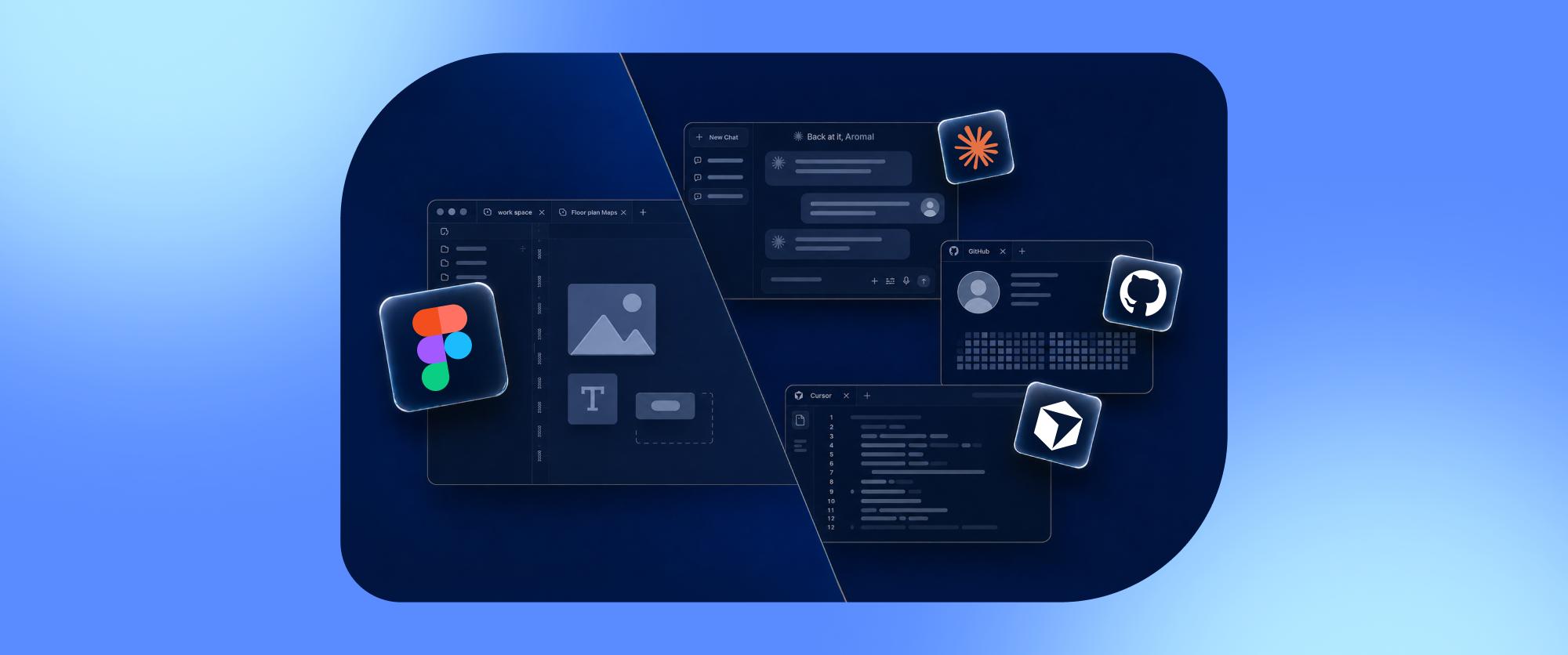
Today, with AI filling the gaps in my knowledge, I can move into unfamiliar territory fast enough to matter. I can enter a codebase I have never touched, understand how it is structured, and contribute to it. I can build prototypes close enough to production that stakeholders can respond to the real thing rather than an interpretation of it. I can own a decision all the way through to finding out whether it actually worked.
That is the version of design I want to practice. That is what being a designer in 2026 means to me.
First lesson: understand the system before you touch the screen
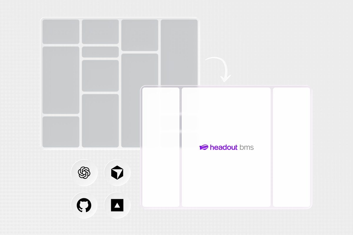
My first project was the booking management system, an internal tool used by operations teams to handle bookings and everything around them.
A structure existed but had been growing organically for years, features tacked on until the cracks started to show. My job was to redesign it with a proper foundation: defined rules, a clear hierarchy, enough structure to absorb future complexity without buckling.
Internal tools carry years of operational knowledge that is not visible on the surface. A button might represent a business rule, a permission, or an exception that three teams agreed on eighteen months ago. You cannot design your way through that without first learning the system underneath.
I worked closely with Rama to map the existing flows and used Claude to turn that understanding into a working end-to-end output, functional enough for engineering to build directly on top of. Rama was away for part of the project, which meant I had to keep moving through the ambiguity rather than wait for every answer. When he returned we reviewed the system and closed the gaps together.
Good internal-tool design is not about making complexity disappear. It is about organising complexity so people can act with confidence.
Closing the full loop for the first time
Shortly after, I ran my first end-to-end experiment on the Headout product: a peek animation on the variant selection cards, designed to make available options more visible and prompt more engagement from users browsing experiences.
The idea started as a hypothesis. I moved it into code, raised a pull request, set up the A/B test in Statsig, watched the data come in through Mixpanel, fixed the bugs that surfaced once real users were touching it, and eventually rolled it out to 100% of users.
That sequence sounds like a list of steps. What it actually was: the first time I experienced complete ownership of a product decision, from the original thought to the moment it was live for everyone.
What I had not expected was how much the measurement phase would change how I thought about the design phase. A live experiment does not care how persuasive the rationale sounded in a review. A treatment can improve one metric while introducing friction somewhere else in the journey. Early data can look promising and settle differently as more users come through. The probability of a variation winning is not the same as evidence that it improved what actually mattered.
All of that pushed me to think differently about what happens before an experiment runs: what the hypothesis actually claims, which metric is the real test of success, and which trade-offs are acceptable. Analysis should shape the design from the start, not arrive as a separate phase once the code is already written.
Closing that full loop, even once, resets your expectations of what ownership means.
A fixed deadline is a design tool
A few weeks later Rama brought me a completely different brief. Headout was hosting an event bringing together designers and AI practitioners, and we needed a full digital experience to go with it: a website that doubled as an app entry point, augmented reality interactions triggered by physical objects in the office space, printed rubber stamps that came to life through a phone camera, and a resource hub for attendees.
I had not built anything like it before.
The deadline made that irrelevant. There was no time to wait until I fully understood the toolset before starting. I learnt by attempting it, finding where things broke, and fixing them. The physical office became part of the interface. People would be walking through the room, scanning objects, moving between their phones and the space around them. The design had to work in a crowded room, not just in a browser window.
What the event project gave me, beyond the specific skills, was a way of approaching unfamiliar briefs. Take the real constraint seriously and let it sharpen the decision. Hypotheticals are useful. Things that have to go live in 3 days are better.
Learning motion by building it
Around the same time I began working on the Dex website. Dex helps people understand the places around them, and the website could not feel like a conventional sequence of static sections. We wanted the story to unfold as someone scrolled through it.
That meant images changing as the user moved down the page, pacing that felt cinematic on desktop and still coherent on mobile, and a structure where the scrolling itself was doing narrative work.
I had not designed scroll-based interaction before. There is a real difference between imagining motion in a design file and designing motion that can actually be implemented. In Figma, two frames imply a transition. In a scroll interaction, the transition is the design: when does the next image enter, what stays fixed, what happens when someone scrolls quickly, does the story still hold on a short viewport.
Every constraint made the decisions more specific. I learnt this one not by studying it but by attempting it, finding where it broke, and revising the idea with the failure as new information.
From Figma file to pull request
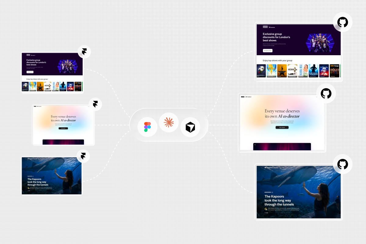
One of the more consequential stretches of my first 90 days was helping migrate Headout's websites out of Framer and into our own codebase.
It started with the London Theatre Tickets group bookings page. I needed to understand how the repositories were structured, extract the existing design into code using Claude, work through convention issues with the engineering team, wire the form to n8n workflows, Google Sheets, and Slack, and take it live without users noticing anything had changed.
After that I helped the rest of the design team do the same with our other Framer properties. The cumulative saving was significant enough to remove an external dependency the whole team had been carrying. More than the cost, it changed how the team thought about where design work ends. GitHub stopped being the place where engineering happened after design. It became part of the work itself.
The second attempt is always faster
Headout runs an internal hackathon called Hackin every year. This year, over 80 teams competed across five categories for one winner per category.
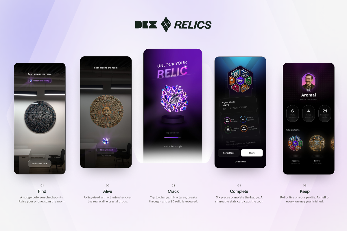
Our team, The Relics, built Relic Quest: an augmented reality treasure hunt layered on top of Dex, designed to make guided tours more interactive and memorable for guests. We won the Five Stars category, for the hack guests would rave about. The entire working experience was built in 48 hours.
What made it feel significant beyond the result was how directly it drew on the AR work from the design event a few weeks earlier. The first time you learn something, you are mostly figuring out the tool. The second time, you are shaping the experience. You remember where the first version became confusing. You know what needs testing earlier. You spend less time discovering and more time deciding.
Learning rarely arrives in a neat sequence where one project prepares you for the next. More often you struggle through something because the current work demands it, and then a different problem lets you use that knowledge with more confidence and precision. The hackathon made that compounding visible in a way that was hard to miss.
Building foundations instead of screens
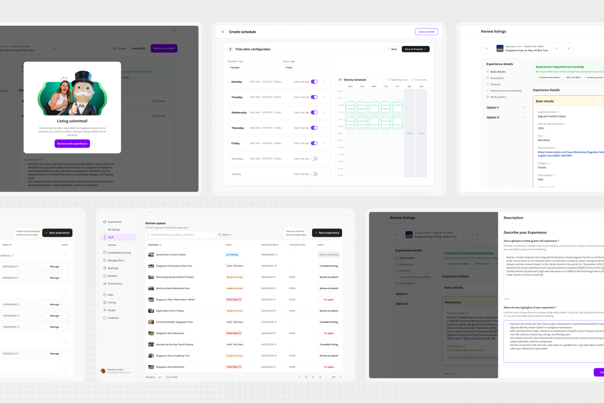
Most recently I have been on Hub, Headout's supply partner portal, which is getting a full revamp. I am working on the design system from the ground up, starting with the components that will have the widest downstream impact.
The first major one was the table.
Tables look straightforward until you actually design them. A table is a small product system: dense information, hierarchy, sorting, filtering, loading states, empty states, errors, permissions, long values, and users who may not be power users of complex SaaS tools.
I studied systems like IBM Carbon and Atlassian, not to copy them but to understand how mature systems define hierarchy, states, and reuse, and whether the same assumptions apply to Hub's users. The questions that shaped the work were specific: what belongs at the row level and what should live in a drawer, which actions should stay visible versus collapse into a menu, how do you communicate status without relying entirely on colour, what must stay consistent across every table in the product and where should the component stay flexible enough to adapt.
These are not glamorous questions. They are the ones that determine whether a design system actually scales or just looks like one.
I designed the component directly in the repository, aligned it with stakeholders, and have been building functional prototypes for upcoming Hub features alongside it. The earlier projects taught me to move from intent to output quickly. Hub has been teaching me that speed without a foundation creates its own kind of debt. A table designed for one screen solves today's problem. A table designed as a system improves every workflow that follows.
What actually changed
Sitting down to write this, I went back through everything and noticed something.
Every project involved a moment where I crossed a line I had not crossed before: into a codebase, into AR tools I had never touched, into experiment data, into a design system built in a live repository. Each crossing felt uncertain at the time. Each one slightly moved where the line sits for the next project.
The question I used to ask at the start of an unfamiliar brief was whether I had done something like it before. The question I ask now is what I need to understand to move it forward responsibly. Those questions sound similar but lead to very different places.
AI has made the second question more answerable than it used to be. It did not remove the need to understand the workflow, choose the right interaction, read the data, or decide what the user actually needed. It made the gap between "I have not done this before" and "I can do this" shorter.
The output is faster. The responsibility is still entirely mine.
Hub is ongoing. There is more I do not know than I did three months ago, because the work keeps getting more specific. That feels about right.
A few people to thank
None of this happened in a vacuum. I am grateful to entire design team and everyone at Headout who brought me into projects, answered questions, and gave me room to move quickly.
A specific thank you to Rama, our Senior Design Director. Every project that pushed me hardest had him in the background asking the right questions at the right time. I could not have found my footing this fast without him.