Built, Not Just Prototyped
How helping people find photo spots taught me about mediums?
Have you ever gone on a guided tour, listened closely to every story, and still walked away without capturing the best photo of the moment?
Chances are, yes. And here is why. A guide tells you what a place means, but it almost never tells you where to stand for the shot everyone else will screenshot from your profile. That small gap, between understanding a place and capturing it, is often what decides whether someone remembers the visit.
Closing that gap turned out to be a much bigger design problem than anyone expected. Earlier this year, two of our Dex partners in New York asked us for exactly this: help guests find the best photo moments during the tour, where to stand and what to shoot. Dex is our AI powered audio guide, and this became a feature we call photo spots.
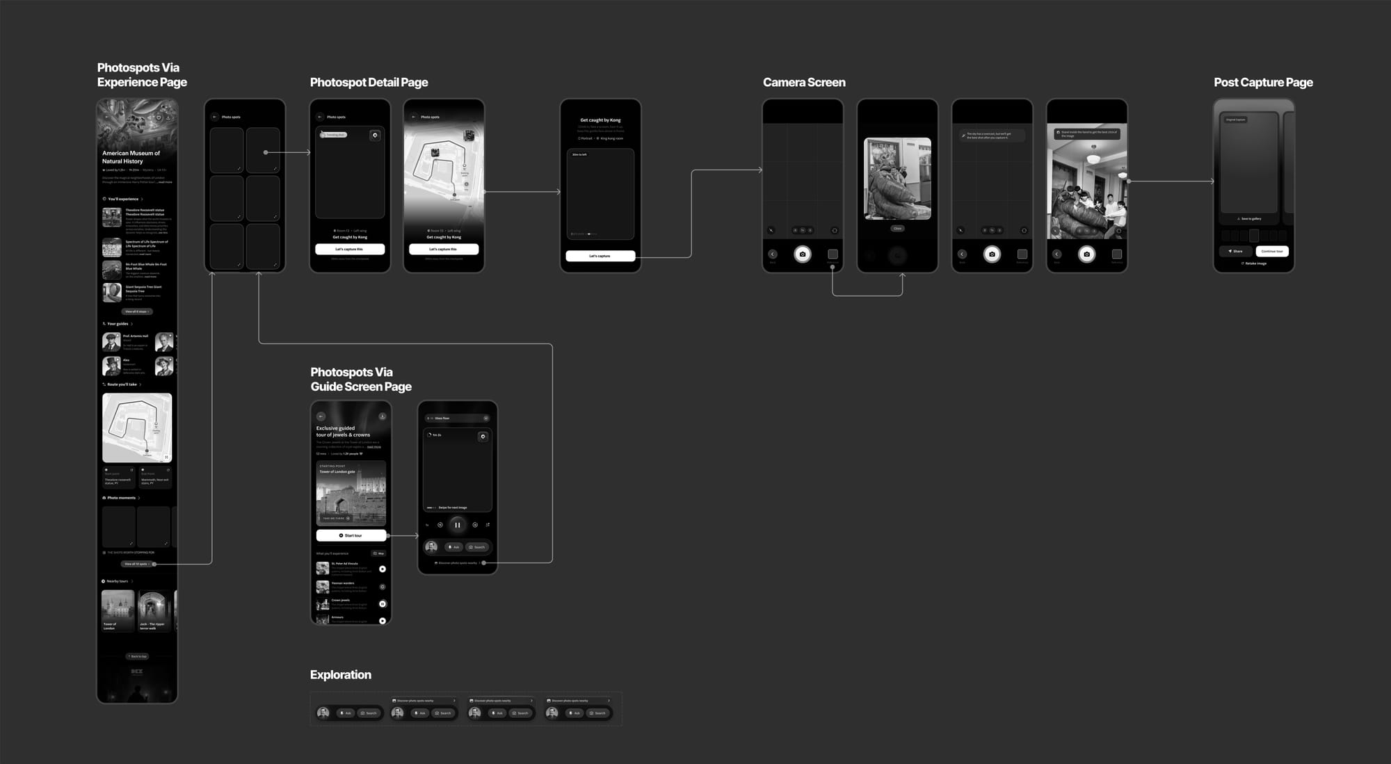
Its heart was a gallery, the screen you flick through for reference photos before taking your own, and like a classic design process: Figma frames, tidy variants, a clickable prototype. And every review surfaced the same limitation. A prototype can show what a screen looks like and where a tap leads. It cannot show how a gallery moves, how a swipe resists, or how a photo spot actually plays out from the moment you open the camera. Every stakeholder reviewing the file was forming an opinion on an experience none of us had lived. If the most important part of a design is how it feels, and a file cannot carry a feel, what exactly was I asking people to review?
That question is what this piece is about.
I did not expect the answer to involve a codebase, a simulator, and a pull request with my name on it. But it did.
The brief that would not sit still
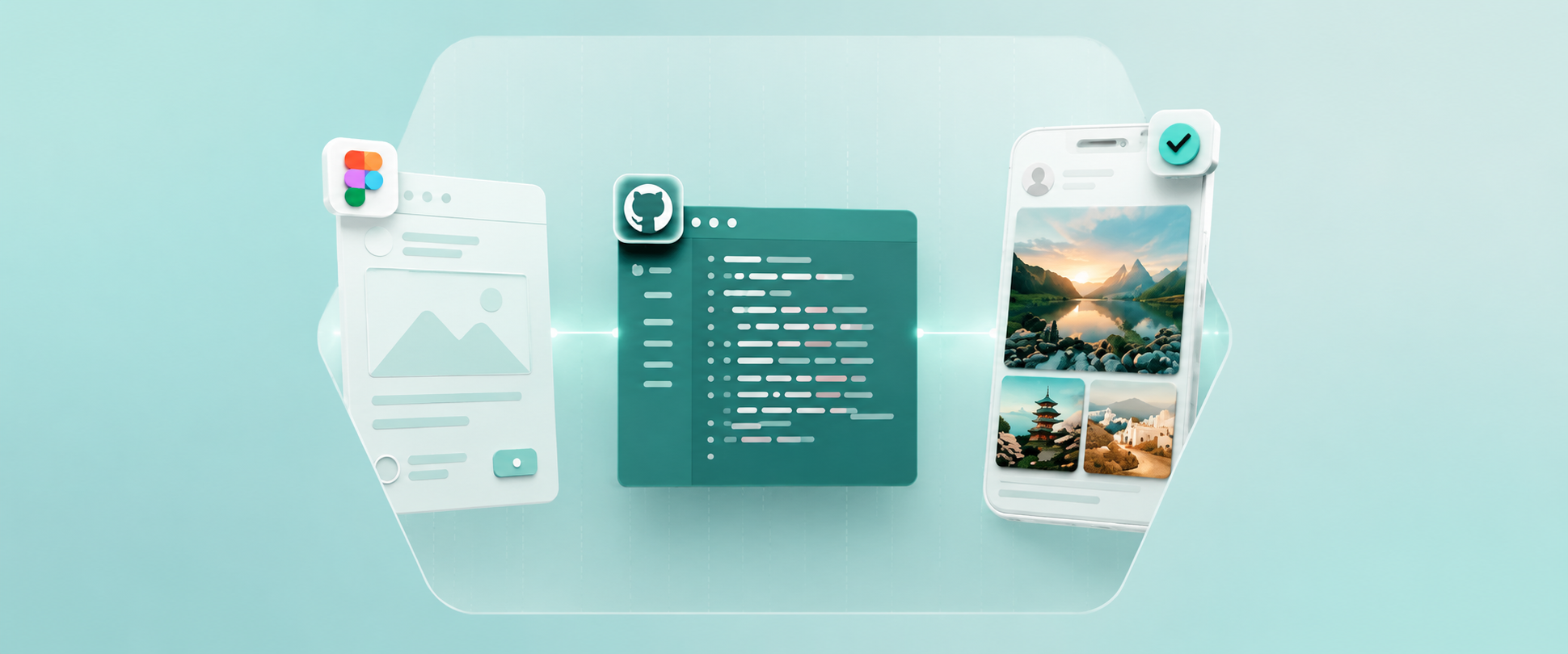
Show people where to take photos. Simple on paper. Slippery in practice. Normally this is where I would have gone back to Figma, built a few more variants, and dropped them in a thread for stakeholders to react to whenever they found time. This time I decided to try something different: build the gallery for real, and see if I could get it running well enough for people to actually hold and use.
I did not start with a plan. I started with the Dex codebase open and Claude beside me, reading through how the app was actually structured, screen by screen, before I touched a single line myself.
I picked the smallest possible version of the gallery and tried to get it running on the simulator first, even before it looked right. Getting one card to scroll properly took longer than I expected, the better part of a day for something that had taken twenty minutes to make in Figma. Getting the whole gallery to feel right, with the right momentum and the right resistance, took several more passes after that.
With every prompt, I got sharper at the exact language that made Claude build what I actually meant, and that got faster the further along the feature I went. I would make a change, run it on the simulator, feel whether it was closer or further from right, and go again. There was no design review in between. The feedback loop lived entirely between me and the build.
A feature is not designed in a file. It is designed in the gap between what people imagine and what they can actually try. And that word, feel, was the whole reason the switch mattered.
Knowing the gap existed was one thing. Understanding exactly why Figma, a tool I had trusted for years, could not close it, took a bit longer to admit.
Where the file stopped working
Here is my honest claim, and you are welcome to argue with it: Figma is a medium, and every medium has things it physically cannot represent.
- A canvas cannot hold a melody.
- A static frame cannot hold momentum, the rubber band overscroll of a gallery, the friction curve of a swipe, or the half second where a card resists your thumb and then gives in.
- For a product like Dex, which lives inside motion and gesture, the decisions that matter most are exactly the ones a frame cannot show.
I checked whether I was the only one running into this. I was not.
- Every designer I asked who worked on anything with real motion, a carousel, a drag interaction, a transition between screens, described the same workaround.
- Build a rough version early, and treat the file as a placeholder for a conversation rather than the conversation itself.
- Nobody had written it down as a rule. Everyone was already doing it quietly.
So I stopped trying to describe the design and started trying to build it.
Learning the app instead of the screens
When I joined Headout, I remember my lead pulling up a live build on the Dex app to walk stakeholders through a feature, instead of the usual Figma design. Everyone in that room experienced the feature as real, not as an interpretation of it, and the feedback that came back was sharp and specific because both the UX and the UI were already sitting in front of them. The whole discussion loop was shorter for it. And my first thought was: I want to be able to do that too, someday.
Cut to six months in, and I was doing exactly that.
I did not sit down with a JavaScript course. I sat down with the Dex codebase, and with a few engineers who walked me through how the pieces actually fit together. That, honestly, is the best place to start if you have no idea where to begin: not a tutorial, but the people who already live inside the system.
The Photospots feature in Figma Design
Headout has a line for this: If AI can, AI should. I did not think about it as a principle while I was doing it. I thought about it as Claude open in one window and the Dex codebase open in the other, going back and forth until the two started to agree with each other.
For a long time the job meant screens: the right layout, the right hierarchy, the right state for every edge case, handed off and hoped for. AI does not remove that work, but it moves the finish line further down the field.
With Claude filling the gaps in my knowledge, I started reading how the app was actually put together. How screens were structured.
Two things came out of that stretch of work. They are also the two I am proudest of this quarter.
First, I understood the app functionally, not just visually. Running the build on the simulator changed my relationship with my own designs. I stopped asking "does this frame look right" and started looking at the live design on the existing app build itself. I would run the tour, hit the photo spots moment, feel where it stuttered, go back, adjust, run it again. The simulator became my canvas, and the design changes were no longer happening on a design file. They were a prompt away, in code.
Second, I pushed the PR. Not a mockup, not a spec, my own design, sitting in the real codebase, raised for review the same way any engineer's change would be. It felt like the moment I had been working toward since I first watched someone else do it.
What I did not expect was how much this would change the people around me, not just the work.
What actually changed in the room
The most surprising shift was not in my skills. It was in the conversations.
Here is the example that actually changed things for me. Early on, we were deciding where the photo spots widget should sit on the guide screen: below the main content, above it, tucked inside an existing card, or expanding out from one. On paper, this reads like a UI question, four positions on a screen. It is not. It is a UX question about hierarchy and attention, whether a photo prompt competes with the audio tour for someone's focus or waits quietly until the right moment. Four static frames could show me where each option sat.
The live design for Photospots feature
None of them could show me which one felt like it belonged. Once the same four options existed as a real, tappable build, the structural question resolved itself in a single sitting: you could feel immediately which placement respected the primary experience and which one fought it for attention. That is the shift that changed the game for me, not writing better UI, but being able to test structure and direction the same way you test a hypothesis, by living inside it instead of describing it.
When feedback happens over a running build, the conversation gets closer to the code itself. Someone flags that a card feels too heavy, and instead of noting it down for a later sprint, I can open the file, adjust the spring value, rebuild, and hand the phone back within minutes.
The collaboration moved from translation to review. Which sounds like a happy ending. It is not quite the whole story.
The first step, not the destination
I am calling this my first step toward being a design engineer, and I want to keep the word first honestly.
Plenty of moments where asking an engineer is not a fallback but obviously the right move. The PR I pushed was reviewed, corrected, and made better by people who know the system far more deeply than I do.
But something has moved fundamentally. The question I used to ask at the start of a feature was "how do I communicate this design?" It has changed to "what medium does this design actually need?" Sometimes the answer is still Figma. For photo spots, the answer was code, because the design was the physics.
Thank you
To Ramakrishna, who pushed me to actually learn and build with code instead of just talking about wanting to, long before I believed I was capable of it. To Mukul, for the inspiration to start building, for the very first day I sat across a room full of stakeholders and walked them through the first version of this design, a moment I am still unpacking, and for the support that has not stopped since. To the whole Dex engineering team, without whom none of this would have been possible, for teaching us patiently while also reviewing our work and shipping their own, often in the same breath. This is not a win I can claim alone, it belongs to the whole Dex team.
Designers here are now able to take their work live themselves, and that shift feels bigger than any one feature. It means we are no longer just handing off ideas and hoping they survive the journey to production, we are learning to carry them there ourselves, at a pace that finally matches how quickly everything around AI and design is moving.