Headout sells experiences (e.g., tours, attractions, events, live shows) across the world. Millions of customers find & book experiences with us using our websites and apps (products). I recently joined the Headout team to solve design & product problems.
We found ourselves amid countless requests for “small design changes” that need attention “asap”. Years of such small design changes done asap had resulted in a fragmented, hard to manage design. There was clear design debt, and we couldn’t keep defaulting on it.
The products support eight languages, and all products evolved with their unique design — from interactions, features to aesthetics. The fragmented state of the design looked like a series of oddly made decisions. The underlying reasons for the design decisions were not clear.
The Inevitable Redesign
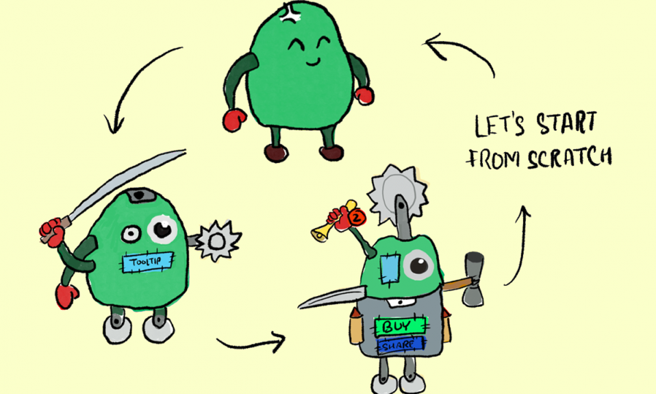
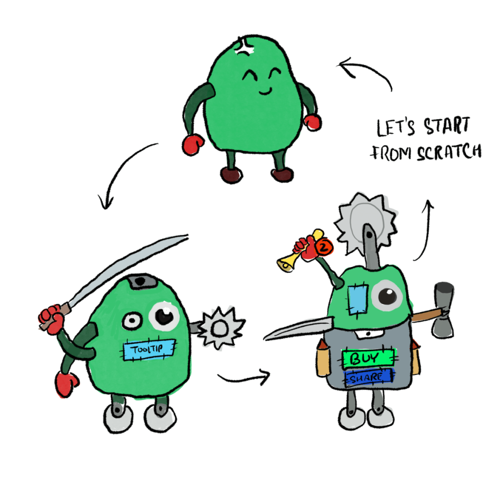
Let’s throw everything away and start from scratch! Amiright? There were too many problems to solve after all, with new ones emerging each day. If this situation sounds familiar, you’ve inherited a product at a high-growth startup, and you may have arrived at a similar conclusion.
However, there’s a problem with that conclusion. It suffers from survivorship bias.
Only a live design gets bugs! Unless we’ve evidence that the design is utterly failing its purpose the design works. Overmore, if we’ve successfully added new features to the design for years — the design is extensible and robust.
It’d be crazy to throw away a system this good without studying it. Not studying it would add unknown risks for the user experience and the business.
The first step was to study the existing design and find the good (helps the user), bad (user doesn’t care), and ugly (deters the user). While going through the process of studying & redesigning the existing products at Headout, I took notes and here’s what I learned.
Let’s begin this process!
Design audits are a powerful tool to study existing products and how customers interact with it.
However, halfway through writing the audit goals, I realised my mistake. I was missing critical steps. I didn’t know who the customer was. Who were they, and why were they using our product?
I knew nothing.
So I turned to another design tool — the one that helps us study, understand, and model our customers (with their nuances and market realities) — User Personas.
User Personas without big teams or budgets
We didn’t have months, and a large team to conduct detailed research. Existing UX methodologies are compelling, but they fail in agile and startup environments — where clarity is iterative & asynchronous.
With the years of data to study, we took an iterative approach to draw our (provisional) personas:
- The existing design
- Recorded user sessions for several critical flows
- Labelled & structured customer support communication (chats, emails, call recordings)
- Data for marketing funnels and their learnings in the paid & organic channels
- Existing knowledge of people who’ve been running operations, customer support, and the marketing department
- Relevant research published by airline, hospitality, credit card, and other companies
Interview with stakeholders gives us models (that different teams use to understand business or the customer) and a starting point.
Data from sessions recordings, customer support tickets, recorded calls, NPS rating, App Store/Play Store ratings — helped us verify the initial models and add more details. This process gave us a list of 20–25 attributes that affected the customers, and therefore, our business.
Finally speaking to 10+ potential users (people who took experiences abroad in the last 6 months, regardless of Headout) helped us reduce the 20–25 attributes to just 7:
- The motive matrix– Social, Knowledge, Location/Physical, and Leisure. Different flavours of the motive take the front-seat as the user’s journey evolves
- Time at hand / Schedule: flexibility/rigidity in schedule
- Cost sensitivity
- Specificity / Preferences: Language, Cuisine, and other preferences
- Comfort level: Distance from home city/town & prior experience
- Who’s booking: Is the customer booking themselves? Do they make the decision?
- Who’s accompanying: Who all are coming along for the experience with the customer?
These are all the factors that can affect a customer’s decision. These are not “independent variables” (Eg: Cost sensitivity & specificity are heavily co-related); these attributes describe all possible information that a customer would consider while deciding to buy from headout.
Speaking to the customers also revealed our key-attribute — one attributes that disproportionately affects all other attributes — “Who’s accompanying”. All other factors (price sensitivity, motive, etc.) change depending on who is accompanying the customer.
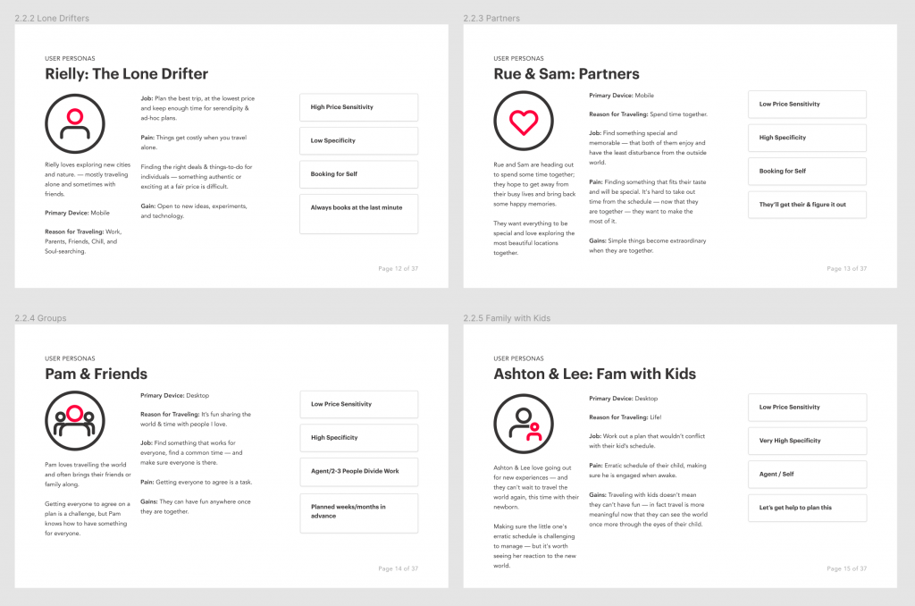
Using this insight, we draw our user categories (not personas):
- Lone Drifter: heading out alone
- Partners: heading out with the special someone
- Groups: friends, family, coworkers,
- Family with Kids: kids change everything
There are several personas in each user categories, but not all prefer us. From here, specific stories of the customers help fill in details, affinities, and help us narrow down to our provisional personas:
Now that we finally have our user, can we begin the audit?
Not yet. We may know that Sam & Rue are likely to land-up on Headout. We don’t know a lot — when do they do this? How many times do they interact with us? What are the different stages of this story? During this evolution, how did different features of Headout become relevant to the customer?
We knew the characters, and maybe even a little about their motives & settings — but we are missing their stories.
E.g., Is Sam more likely to use our search feature than Rue? When would they use it? Would their behaviour be the same?
To help us understand how the customers’ journey evolves, and what information/action is necessary at what stage, we turn to another excellent design tool — UX Maps.
Mapping the territory before building a city
There are two specific maps we used — Experience Maps and User Journey Maps.
Think of experience map has the full-picture story outline. How was the customer’s life before, after, and regardless of Headout? What happens way before the customer even decides to go for experience? How does the journey evolve?
Experience Map gives us the framework to split the customer story in logical part, see various factors that affect customer’s psychology, and when we zoom-in to specific customer-product interactions — we begin to draw our high-resolution “User Journey Maps”.
A journey map tracks a specific persona, performing tasks to achieve a specific goal (Sue searching for experience, Pam booking for her and her friends). We detail out each step they take throughout their journey.
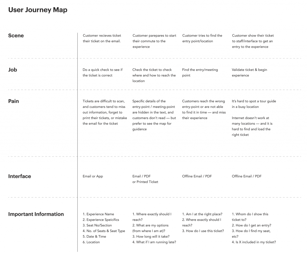
With this clarity — we can finally make an exhaustive list of “use cases” — the feature or flow we are auditing, must be measured against these use cases. (Eg: For the search feature, the use cases could be results, global results, no results, multi-lingual, and so on)
Using this list of use-cases, we can go through each feature and flow and objectively measure how good/bad/ugly the existing design is for the mentioned use-case.
A report on how well the existing design covers the given use-cases would be our audit report. Finally, we are ready.
Design Audits to study, learn, and document existing behaviours & design
Coming back to our use cases — this is what a rough derivation looks like:
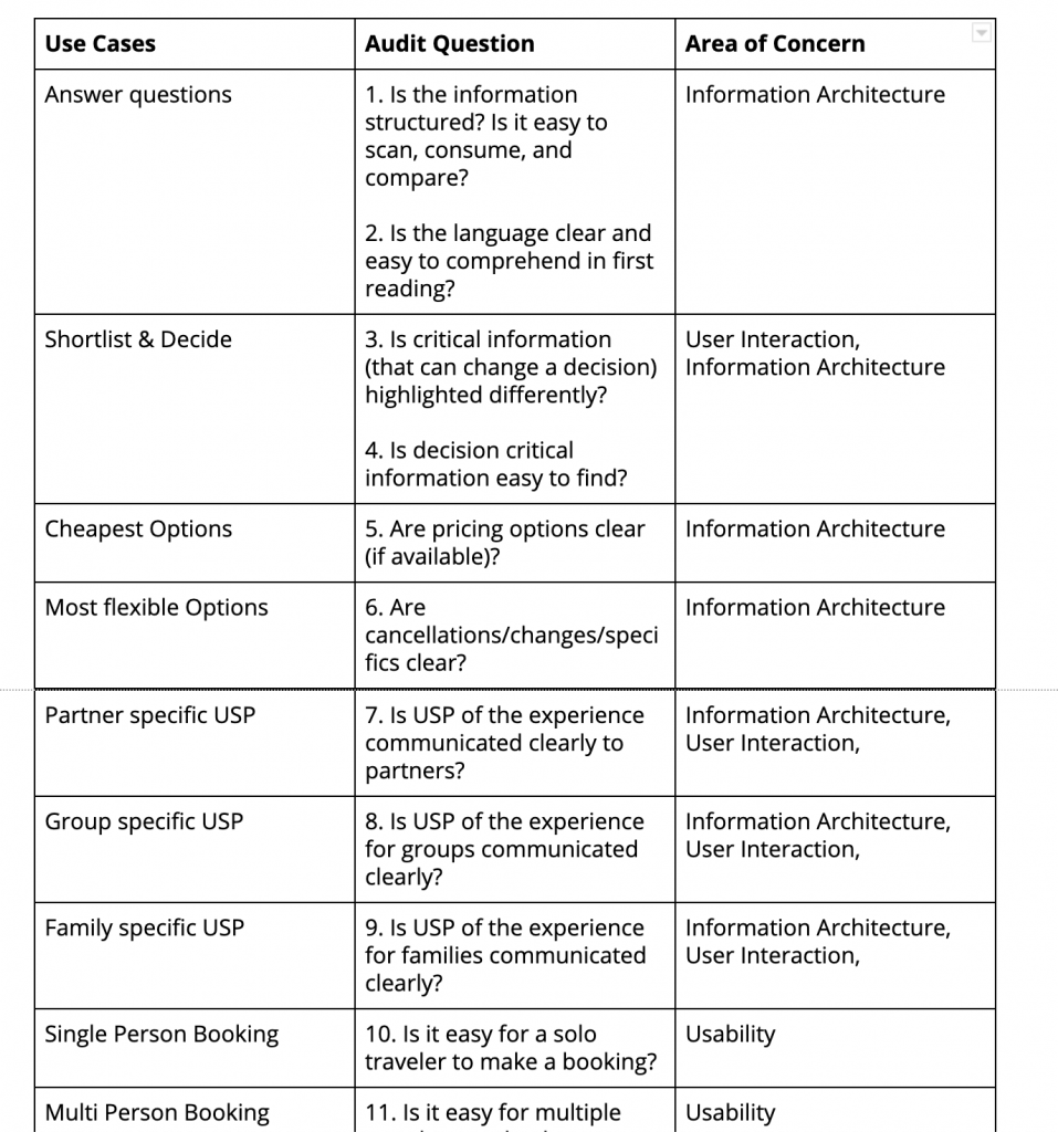
The questions depend on the goal of your audit, and of course, the background work we’ve done so far.
We used customer support tickets, customer feedback, stakeholder feedback, recorded session, and some first principle thinking to answer the audit question.
The result was a lengthy list — what works, what needs improvement, and what’s broken. However, not all issues are equally important.
We need some way to validate further and prioritise our list. We did this in two steps:
Putting the Audit Results in Action
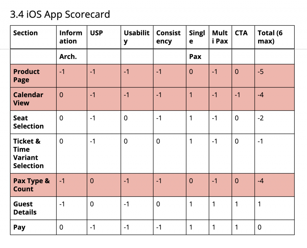
First, we rated each step, interaction, and state (within a feature or a flow) on a simple scale:
-1 — deters the user
0 — works but needs improvement
1 — works well as it is
This helped us rank what parts are more broken than the other (as per the audit).
Second, we use conversion and funnel data to see validate & find further patterns in user behaviour. (E.g.: The audit may find step X is broken in the funnel, but how many people get stuck there or abandon? Can we measure the behaviour in some way?)
These steps helped us focus on the critical problems, keep related issues in mind, and ignore the rest.
Now we finally understand how the existing design works, and why it works. We also understand the dependencies and edge cases better. Now we can begin to redesign.
We have much to start our redesign:
- The User Journey Maps: to help us see the overall problem the design must solve for
- The Use Cases: from the user journey map, give us a full range of cases to design for
- The Existing Design: especially the parts that work well (don’t fix what’s not broken)
- The List of Problem Statements: from the audit report, the parts that don’t work in the existing design
Now we can make informed decisions about how to redesign each workflow, use case, step, component, and state.
At this point, we can go back to storyboarding or journey mapping to make sense of audit data; we can also think about a style guide, component library or a design system. However, that topic and the process of redesign deserves a separate post.
There’s a pattern of questions that repeatedly emerges during the process:
- Should we redesign this
- Should we throw this away?
- Should we keep this to redesign later?
- Should we merge the duplicate functionality here?
I use the following decision tree to help me find the answer:
4R Decision Tree: Should you replace, redesign or refine?
You’d need the audit to answer these questions. If you didn’t audit a particular design/feature/element — don’t redesign it.
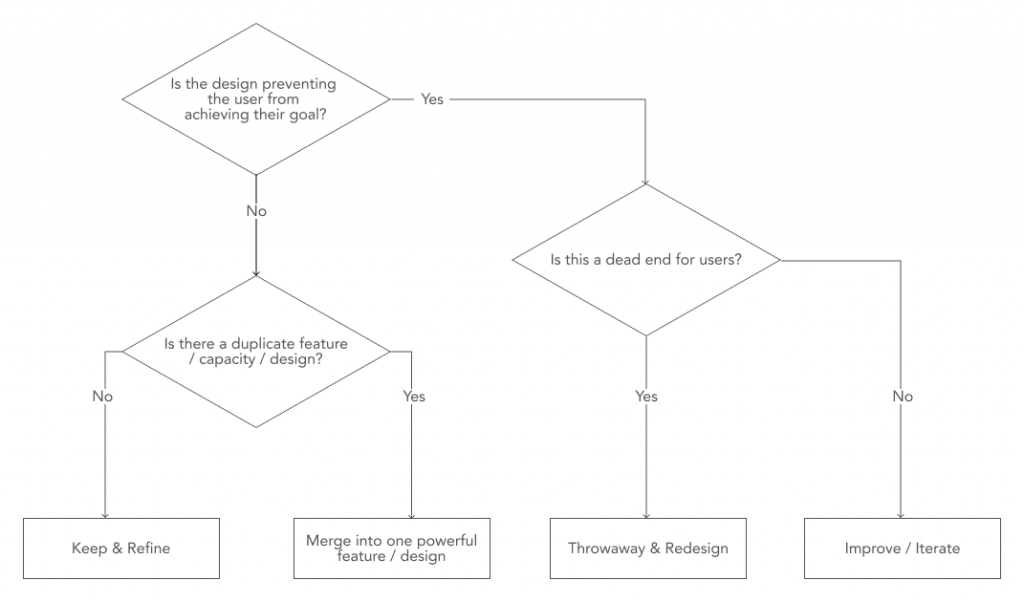
- Remove whatever hampers the user
- Replace duplicate & weak features with single powerful ones
- Redesign dead-ends
- Refine & reintegrate what works with the rest of the system
If the answer is not clear or doesn’t feel right, there could be two reasons:
- You need to break down the feature/state/element further and ask the questions again
- Your audit is missing some critical information
Closing
During my first 60 days at Headout, I took notes of my thoughts, questions, ideas, and discussions. This post consolidates my learnings from those first 60 days.
The tools I’ve shared here are age-old, and the design industry swears by them. However, instead of following a checklist blindly — I wanted to (re)discover what tools are relevant and why.
The short deadlines and a small team forced us to rethink how to break free from the prescribed templates, checklist, and processes and find something that works for our market, customer, and business realities.
Most important — study the existing design and how your customers use it before you redesign.
How do you make sense of inherited design? Do you use any of the tools I shared? How have you tweaked the process to improve the quality & relevance of the outcome — both in design artefacts & final designs?
Let me know in the comments or on twitter.
Originally published at https://www.64notes.com.
Hear or watch the article here