Millions of customers from over 120 countries use Headout every month to book experiences like guided tours, attractions, and activities.
We have over 5,000 listed products; each may have several partners fulfilling the experience. For these products, we generate more than 5,000 types of tickets on our platform.
This is how most of these tickets looked like:

Meme: Confused (video can’t load in your browser)
Customers were missing out on their experiences because of bad ticket design! The most critical of these issues were:
- For print tickets, customers were missing out that they had to print it
- When the customers received a mobile ticket they would reach the location only to find out their network/internet does not work
- Customers were missing out on the location they’re supposed to reach
- Customers were not able to locate the Bar Code, QR Code, or the partner ticket ID required to access the experience
The content & marketing team did an audit & redesigned the ticket:

The revised version of ticket was better; but important information was still easy to miss.
There were some improvements. However, the problems wouldn’t go away.
Meme: Confused (video can’t load in your browser)
At first glance, we see several issues like:
- That QR Code looks like a way to access the 5% discount; it’s not — the on-ground staff scans it to validate the ticket
- Most people will skip the text (it’s critical to read it)
- Maps look better, but there is visual noise and the contrast ratio doesn’t survive a black & white printing
With an ever growing number of listings, tickets, and usecases we needed something more robust.
Let’s redesign the tickets, right?
Sure. Let’s start by taking a look at the information we are communicating. Here’s a list (most of) the variables that go into a ticket.

Most of these variables have at least two states (Present & Absent); some have 4+ states & several ways to represent the data.
That’s 30+ variables with at least 27×2 = 54 states.
Our simplest ticket uses 7 variables (7x~2 states = ~14 states) from the list. That’s ~3,432 combinations. [C(n,r) => 14!/(7!(14-7)!]
With the remaining 20+ variables — There are at least ~1,84,756 combinations that exist!
Of course, not all these combinations would be realistic, but even if we were to take a conservative estimate, only 10% are realistic; that leaves us with at least 1,800 additional combinations to design for.

We need a better way than iterating each possible combination. Or checking if it’s realistic.
Taming the Beast
Using Qualitative Data in Design Process: Support Tickets, Chats, NPS Comments, App Store & Play Store Ratings, etc.
We create design frameworks to manage complex problems like these. What’s a framework, and how does you create one? Let’s learn by building one!
We are in the process of building our Design System. The goal of the building this system is to aid designers in:
- Understanding the problems: For this, we use design frameworks
- Iterate solutions: For this, we make component libraries and style guides like — UI Kit, Print Style Guide, Ad Style Guide — which are documentation of decisions & constraints.
We start with problems. When in doubt, focus on understanding the problem better.
Some context can help us tame the ticket madness. This is where stories of our customers, who used these tickets, came in handy. We didn’t have to look too far — the customer ops. team had detailed stories of these customers, and we had NPS comments & support tickets raised by the customers.
These stories & narratives can help reveal insights, and validate our hypothesis. Let’s take an example of 3 such NPS comments that illustrate this well:

The meeting point is trouble.
We can see clear patterns; and use customer’s own words & actions to map their state of mind, abilities, reality, problems, and the flow of events.

At this point, we have fair amount of data, stories, and evidence for the next step:
Our old friend — mapping. Here are 3 example maps we could draw:
- Customer who bought the ticket over ~24 hours before the experience
- Customer who purchased the ticket within less than ~24 hours before the experience
- Customer who purchased a combo which may generate a single, two or more tickets ( this leads us back to #1 & #2 as sub-journey maps)
Let’s see what usecases emerge, as we try to map our customers’ journey:

Example User Journey Map: This helps us find, study, and manage usecase.
As we draw our timelines, we get a better view of what happened before & after the problem(s), and how these events relate to each other.
Designing for the happy path may seem like an obvious step, but what happens on the unhappy paths are constraints for the happy path.
E.g; Customer reaches the meeting point and realizes they had to print the ticket — there’s nothing they can do now. We can proactively solve this issue by marking the tickets, emails, and remind our customers to print the ticket well-in time.

This exercise gives us:
- Usecases: that we’ll design for, including the problem statements we started with. We use the information/variables and their various states & representations to solve these problems
-
User Concerns: that allow us to make “groups” of these usecases,
which, further, allows us to:
- Control & document side-effects (shared use-cases and/or information)
- Allow us to prevent the problem; rather than “fixing” it with reactive support
- Priortize which user-concerns should we iterate, test, or deliver first (based on frequency, cost, urgency, etc.)
Let’s pick one concern from our map above — “Where do I need to go?” — to illustrate:

The First part of our Ticket Design Framework is the definition of the problem landscape.
Now, we can ask useful questions to our teams (data, tech, category, support), like:
- How often does this happen?
- How many tickets do we generate every day with these vs these iterations?
- What’s the typical count of people per booking?
Or to our customers (not verbatim):
- What happened after you got your tickets?
- How did you make sure you’re at the right spot?
This helps us prioritise and tame the scope of work.
Now we start to study how these variables relate to each other, and we can make guidelines around how to best design for them.
Let’s take the example of these variables & the states they may exist in:

Let’s say we have to add another variable to this structure:

Well that was easy! Also, at this point we can check for all side-effects.
Let’s go one step further — what’s the best way to communicate Validity?

Writing the full date is the best way to communicate validity (for print). We can explore options, document the final decision and the reason for that decision.
Not only the were we able to understand the problem, the solution (communicate information), and architect the information, but this also allowed us to think harder about the small details.
This makes iterations more meaningful, and you can quickly check them against your problem statements.
Iterating for Solutions
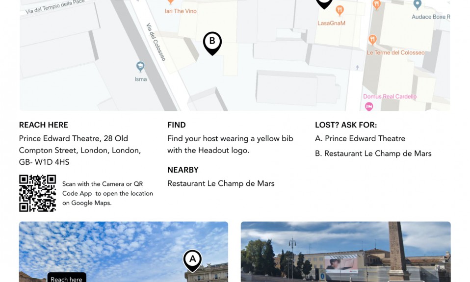
Remember our meeting point problem? This is the new version:

Some improvements include:
- Meeting point with landmarks (A & B) in picture and map format
- “Reach Here” is clearer than “Location”
- A link to Google Maps on the mobile & email version, and a scannable QR code to open the link in Maps on the print version.
- Clear instructions on whom/what to find when you reach the meeting point; we often try to include photos of the guide
- Landmarks described in easy to show/say words to help customers locate the meeting point; should they feel lost
Our guides were hard to spot — another problem highlighted by the NPS comments. So we designed T-shirts for our guides:

Our brand colour is easy to spot in Europe; where most people wear neutral colours. Name of the City & word “Headout” are visible in front, the word “Guide” at the back (which doubles up as a discount code).
Here’s what the final tickets look like:
Example Print Tickets:

Sample print tickets (we are still optimizing map colours for B&W print).
Mobile Ticket Prototype:
Headout Mobile Ticket Prototype from Sidharth on Vimeo.
Why use Design Frameworks?
- Document problems & nuances
- Understand, tame & prioritise the vast scope
- Separate the problem from the solution: We can keep trying different solutions & ideas, without losing sight of the problems. We can test & measure our iterations against these problem statements & use cases. This also helps inform Product KPI’s and Non-Functional Requirements (for ya’ll PM’s out there).
- Document & understand feedback: Did we get the problem wrong or the solution doesn’t work? Or some other solution is better because of x?
- Help us solve better, by allowing us to isolate the relevant parts and dig deeper
Here’s (almost) the entire process visualised:
Do you see the value of using Design Frameworks at your organisation? Does your Design System document problems? What are the parts you find useful or unusable?
Let me know on twitter.
PS: This article is a result of the conversation on twitter, followed by a video: